Making your sketches work on mobile devices
Setting up a mobile workflow
When you’re developing for a mobile device, you’ll want to be able to test on a mobile device. In order to do this, your device needs to be able to access the sketch that you’re writing, as you’re writing it. The simplest way to do this, of course, is just to upload your sketch-in-progress to the Internet, and then navigate your device to the URL of the sketch. This is fine, and it’ll be how other people eventually access your sketch, but it can get tedious when you’re developing: there’s an extra step that you need to perform after every change, which makes quick iteration and debugging difficult.
If you want to be able to see the changes you make to your sketch as you make them, without the extra upload step, there are a few things you can do, which I’ll discuss below.
Connect to the p5js IDE over shared Wifi
The p5.js IDE starts a tiny web server whenever you run your sketch. With a little bit of cleverness (and a bit of luck), you can get your device to talk to this server over the network. For this to work, your device and your computer need to be connected to the same wifi access point. Here are the steps to follow:
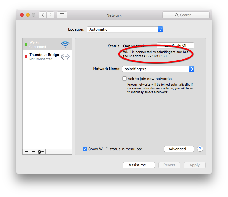
Step 1. Determine your computer’s IP address on your wifi network. On OSX, you can do this by opening System Preferences and selecting “Network.” Your IP address will be shown somewhere beneath the words “Status: Connected” (see diagram below).

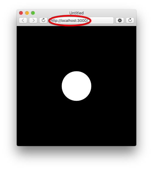
Step 2. Run a p5.js sketch from the p5 IDE. In the sketch window, make a note of the
address in the web location bar (see diagram below). The key part of this
address to remember is the port number—the number that follows :.

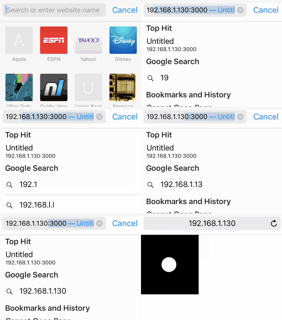
Step 3. On your device, open a web browser and go to http://XXXX:YYYY,
replacing XXXX with your computer’s IP address from step one and YYYY with
the port number from step 2. It should look like this:

Your sketch will probably look a little bit weird (very small), but if it shows up, congratulations! It worked! Now whenever you click “Run,” you can reload the browser on your mobile device to see the updated sketch. Note that the port number may change from one execution to the next (especially if you’re working on multiple sketches at the same time), so keep an eye out for that.
Use localtunnel
The shared wifi solution above may not work, for whatever reason. (For example, some wifi routers disable or filter connections between computers on the same network.) In those cases, you can use a service called localtunnel. The localtunnel service creates a temporary address on the world-accessible Internet that “tunnels” connections to your computer. You can then access servers running on your own computer, even if your mobile device isn’t connected to the same network.
Using localtunnel is a little bit complicated and requires some setup. The first thing you’ll need to do is install Node.js. (As a Javascript developer, you should do this anyway, if you haven’t already. Node is a version of Javascript that you can run on your computer’s command line, instead of in a web browser—super handy, and we’ll take a look at how to use it in an upcoming tutorial.)
After installing Node, open your computer’s Terminal application. (On OSX, go to Applications > Utilities > Terminal; on Windows, select the “Node.js command prompt” option that was installed in the Start menu when you installed Node.js.) Now follow the installation instructions for localtunnel, paraphrased here: at the prompt, type
npm install -g localtunnel
… and press Enter. (If you get an error, you may need to type sudo npm
install -g localtunnel.) The localtunnel tool will be installed.
The next step is to start a sketch in the p5 IDE and note the port number of the URL in the location window (as described in the previous section). Remeber that number and then type the following at the command prompt:
lt --port YYYY
… replacing YYYY with the port number of your p5 IDE’s preview window.
You’ll see a message that looks like this:
your url is: https://rjxqcuugyi.localtunnel.me
In your mobile device’s web browser, navigate to that URL. You should be able to see your p5 sketch. Nice! (Note that the p5 IDE might change the port number of your sketch from one execution to the next, in which case you’ll need to restart localtunnel with the new number.) To stop localtunnel, type Ctrl+C in the Terminal window (or command prompt).
Debugging runtime errors
If your program has syntax errors, or errors that appear only when the program first starts, then you’ll be able to see them in the debug console of the p5 IDE when you first run the sketch (as usual). But if errors occur when the sketch is running, or when it’s loaded on your mobile device, there’s no easy way to see those error messages, since the errors are occurring on the mobile device and not on your computer.
If you’re using an iPhone and an Apple computer running OSX, here’s a good solution that uses Mobile Safari’s Web Inspector (which can communicate with the version of Safari on your computer).
Solutions for other platforms TK!
Making your sketches look okay on a mobile device
You might have noticed that when you ran your sketch on your mobile device that it looked weird—strangely small, most likely. Usually the expectation with mobile apps is that they will take up the entire screen of the device. In order to make this happen in p5.js, we need to do a few things.
The first is to set the width and height of the sketch’s canvas to the size of the device itself. Here’s an example sketch to illustrate:
function setup() {
    createCanvas(displayWidth, displayHeight);
}

function draw() {
    background(0);
    fill(255);
    ellipse(width/2, height/2, 100, 100);
}
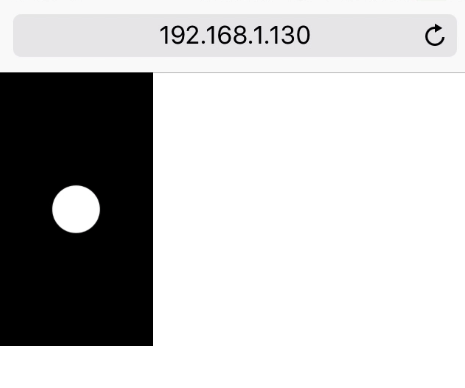
Seems easy enough. But if you load this on the device, you’re likely to see something like this:

Even though we’ve set the sketch to be the same width and height as the
device’s display (using p5’s built-in displayWidth and displayHeight
variables), the sketch is still really small. The reason for this is really
complicated
(more),
but essentially owes to the fact that mobile devices usually have displays with
many times more pixels than their counterparts on desktop and laptop displays.
To make up for this, some devices differentiate between “real” pixels and
“virtual” pixels, for the purpose of determining dimensions and spacing.
Complicated and weird, but there’s an easy fix: open your sketch’s index.html
and insert the following line somewhere between <head> and </head>:
<meta name="viewport" content="user-scalable=no,initial-scale=1,maximum-scale=1,minimum-scale=1,width=device-width">
This line of code instructs the mobile browser to scale your sketch’s web page so it takes up as much of the screen as possible.
Code examples
See the GitHub repository.