CSV files
(Partially adapted from this tutorial and this tutorial. Still incomplete!)
Humans have represented data in the form of tables (i.e., organized in rows and columns) for thousands of years. In a contemporary computational context, the tool we use for working with tabular data is called a spreadsheet. Starting with VisiCalc and Lotus-1-2-3 in the late 1970s and early 1980s, spreadsheet software has consistently been among the best-selling software on personal computers. Today, most computer users are familiar with spreadsheet software like Excel or Google Sheets and many use them daily in their day-to-day work, regardless of their familiarity with math, statistics or computer programming.
It makes sense to want to be able to take work that we do in our programs and import it into our spreadsheet software, or take data from spreadsheets and work with it in our computer programs. But there’s no one obvious way of representing tabular data in computer-readable format, and spreadsheet software from different vendors use different formats internally that aren’t necessarily interoperable. (If you save a spreadsheet in Excel, you might not be able to open that spreadsheet in, say, Apple’s Numbers software.) What we need is a common, easy-to-use way to format tabular data so we can move it between tools without a lot of trouble.
“CSV,” short for “comma-separated values,” is just such a format. A file in CSV format represents tabular data as a series of lines in a plain text file, in which values for each column of the table are separated by commas. Take a look at this table in Google Sheets of the top ten lakes by area in the United States (source data here). In CSV format, it looks like this:
Name,States/Provinces,Area (sq mi)
Lake Superior,Michigan-Minnesota-Wisconsin-Ontario,31700
Lake Michigan,Illinois-Indiana-Michigan-Wisconsin,22300
Lake Huron,Michigan-Ontario,22300
Lake Erie,Michigan-New York-Ohio-Ontario-Pennsylvania,9910
Lake Ontario,New York-Ontario,7340
Great Salt Lake (salt),Utah,2117
Lake of the Woods,Manitoba-Minnesota-Ontario,1679
Iliamna Lake,Alaska,1014
Lake Oahe (man-made),North Dakota-South Dakota,685
Lake Okeechobee,Florida,662
This may look incomprehensible at first, but look carefully and you can see the structure. Each row is on a separate line, and each line has the contents of every cell, separated by commas. (The first line has the names of the columns themselves. This row is called the header, and may or may not be present in a given CSV file.)
Sometimes the character that separates the cells on each row is something other than a comma. A few alternative you’re likely to see are the pipe character (|), a colon (:) or a tab. But even if a different delimiter other than a comma is used, such files are still called CSV files. (Although sometimes files with tab-separated values are called TSV files.)
Exporting CSV files
Most spreadsheet software packages support CSV files in one form or another. Google Sheets, for example, lets you export a spreadsheet as CSV using the “Download As…” item in the File menu. In Excel, CSV is one of the supported formats in the “Save As…” dialog box. It’s important to remember, however, that a CSV file isn’t a perfect replica of the spreadsheet that you’re exporting! When you save a spreadsheet as CSV, you lose all formatting (like fonts, colors, cell sizes). You also lose any charts or images you may have added to the spreadsheet, along with formulas, etc.
The most important (and vexing) thing to remember about CSV files is that the values in the table don’t have types. A CSV file doesn’t distinguish between numbers, currency amounts, dates, etc. That means that when you’re reading a CSV file into a computer program, or importing a CSV file from a computer program into Excel, you’ll need to find a way to recover the data types for each column.
Simple plots of CSV data in p5.js
The CSV file we’re going to work with comes from this dataset about particulate pollution in Beijing (“PM2.5” specifically means particulate matter that is less than 2.5 micrometers in diameter). The data describes several years of hourly weather and pollution readings in Beijing. I like this data because it’s clean and interesting and it’s easy to draw conclusions from it. The people who produced the data also wrote a paper on it:
The paper has some technical content, but overall it’s very readable and giving it a skim will help you understand the data a bit better.
I prepared a slightly cleaned up version of the CSV, which you can download by clicking on this link. Download the file before you continue. The idea is that once you’ve learned how to work with this file, you’ll be able to work with other CSV files as well!
I wrote a handful of example p5.js sketches to work with this data. Each of the examples shows how to plot the data in some way, e.g., visualize the data by somehow mapping each data point (or row) to the screen. The Beijing pollution data is a kind of time series, meaning that the data set consists of a series of measurements at distinct intervals arranged in chronological order. We’re going to draw a simplified kind of line chart (using points only) to plot this data.
What do the data mean?
Open the CSV file in your spreadsheet program. You’ll see something like this:
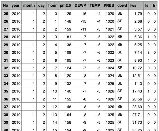
This shows that there are a number of rows (tens of thousands, actually) and a handful of columns with slightly cryptic names. According to the documentation that accompanies the data, the fields have these meanings:
Of course, Pandas can’t tell us what the data in these columns mean. For that, we need to consult the documentation that accompanies the data. Copying and pasting from the web page linked to above, here are the meanings for each field:
- No: row number
- year: year of data in this row
- month: month of data in this row
- day: day of data in this row
- hour: hour of data in this row
- pm2.5: PM2.5 concentration (ug/m^3)
- DEWP: Dew Point (deg C)
- TEMP: Temperature (deg C)
- PRES: Pressure (hPa)
- cbwd: Combined wind direction
- Iws: Cumulated wind speed (m/s)
- Is: Cumulated hours of snow
- Ir: Cumulated hours of rain
Note that these aren’t universal names for these fields. You can’t expect to download a different data set from another set of researchers that records similar phenomena and expect that file to use (e.g.) TEMP as the column name for temperature.
With this in mind, we can imagine what this data will look like in a line
chart. If we plotted one pixel for every row of data with the y value
corresponding to the TEMP field, and the x field corresponding to
where the row is in the file (i.e., what point in time that row has information for), we should get a plot that shows the temperature over time.
Loading CSV files in p5.js
The p5.js library provides a cluster of functions for working with CSV files.
The loadTable() function loads a CSV file into memory as a special kind of
table value (this is specific to p5.js). The loadTable() function should be
called in preload(); the syntax looks like this:
tableVar = loadTable('your_file.csv', 'csv', 'header');
The tableVar variable can be named whatever you want. The 'csv' and
'header' parameters tell loadTable() that this is a CSV file specifically,
and that it has header values (which will be used to give names to the columns
in each row).
This table value has several methods that we can call to work with the data in the CSV:
.getRowCount(): evaluates to the number of rows in the file.getNum(i, "foo"): evaluates to the value in the cell in rowiwith column namefoo.getColumn("foo"): evaluates to an array of all the values in columnfoo
(There are other functions you can call to get out data of other types; see the reference for more information.)
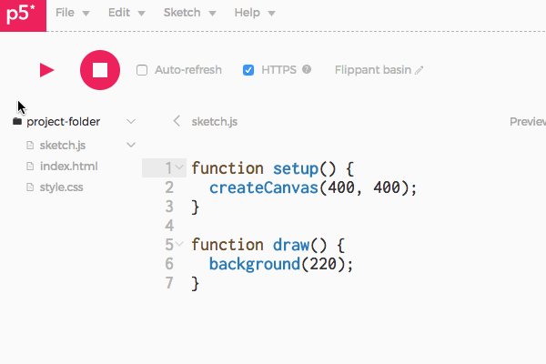
In order to use a CSV file in the p5.js web editor, you need to upload as a new
file in your sketch. To do this, expand the file browser by clicking on the >
symbol above the upper-left corner of the edit window, then click on the
downward arrow next to the folder name and select “Add file.” This animation
shows the process (as of 2017-10-17):
Alternatively, load up any of the examples below and select “Duplicate.” The data file will be available in your duplicated sketch.
Examples: Plotting
(Prose explanations TK, but see comments in source code)
Scatter plot
A scatter plot is an easy way to confirm your suspicion that two columns in your data set are somehow related. In a scatter plot, you select two columns, and every row in the data set becomes a point in a two-dimensional space, based on the value of those two columns in the row.